I used an obscure, free Microsoft tool to revamp my landing page
I'll talk about what Clarity is, its benefits, and some of its limitations.
Hey everyone! Today, I'm going to share my experience using Microsoft Clarity's free tier to improve the landing page of my project, Replicate Codex. I'll talk about what Clarity is, the benefits I've gained from using it, and some of the limitations you might encounter. I don't think many people know about this tool (Hotjar is much more talked-about), so hopefully I can teach you something both new and useful in this post. Let's begin!
What is Microsoft Clarity?
Microsoft Clarity is a free analytics tool that provides insights into user behavior on your website. With Clarity, you can:
- Watch recordings of user sessions
- View heatmaps to see where users click and scroll
- Identify rage clicks and dead links
How I Used Clarity for Replicate Codex
Replicate Codex is a platform where you can search, filter, and sort AI models to find the perfect one for your AI project. To improve the landing page, I turned to Microsoft Clarity for insights. It's very easy to integrate... just drop the code in the <Head> of each page.
Why You Should Use Clarity
Using Clarity helped me understand my users' behavior and make data-driven decisions to improve the landing page. It saved me from making tweaks on guesses, and instead, I could focus on changes backed by actual data.
However, there are a few limitations to consider:
- You need enough traffic for the data to be valuable (a large enough "N").
- Clarity might not cover all aspects of your website - it sometimes doesn't record.
Still, it's great as a free tool.
Issues I Encountered and Fixed
While using Clarity, I noticed people clicking on the "get the emails" button, but it wasn't working. I fixed it by correctly wrapping the <Link> around the button.
I also questioned if I could embed a signup form and whether I should have two input fields so close together (the other being the search field). It made me wonder how to make this better and if the value someone would get from subscribing was clear enough. Signups have stalled out around 50 so I'd like to see if I can improve that.
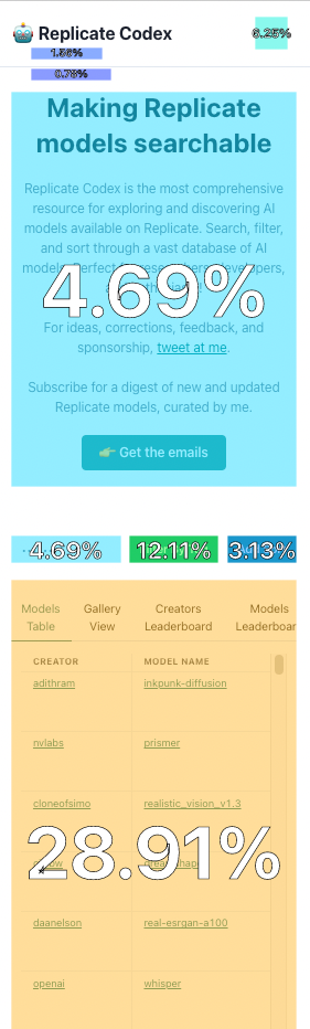
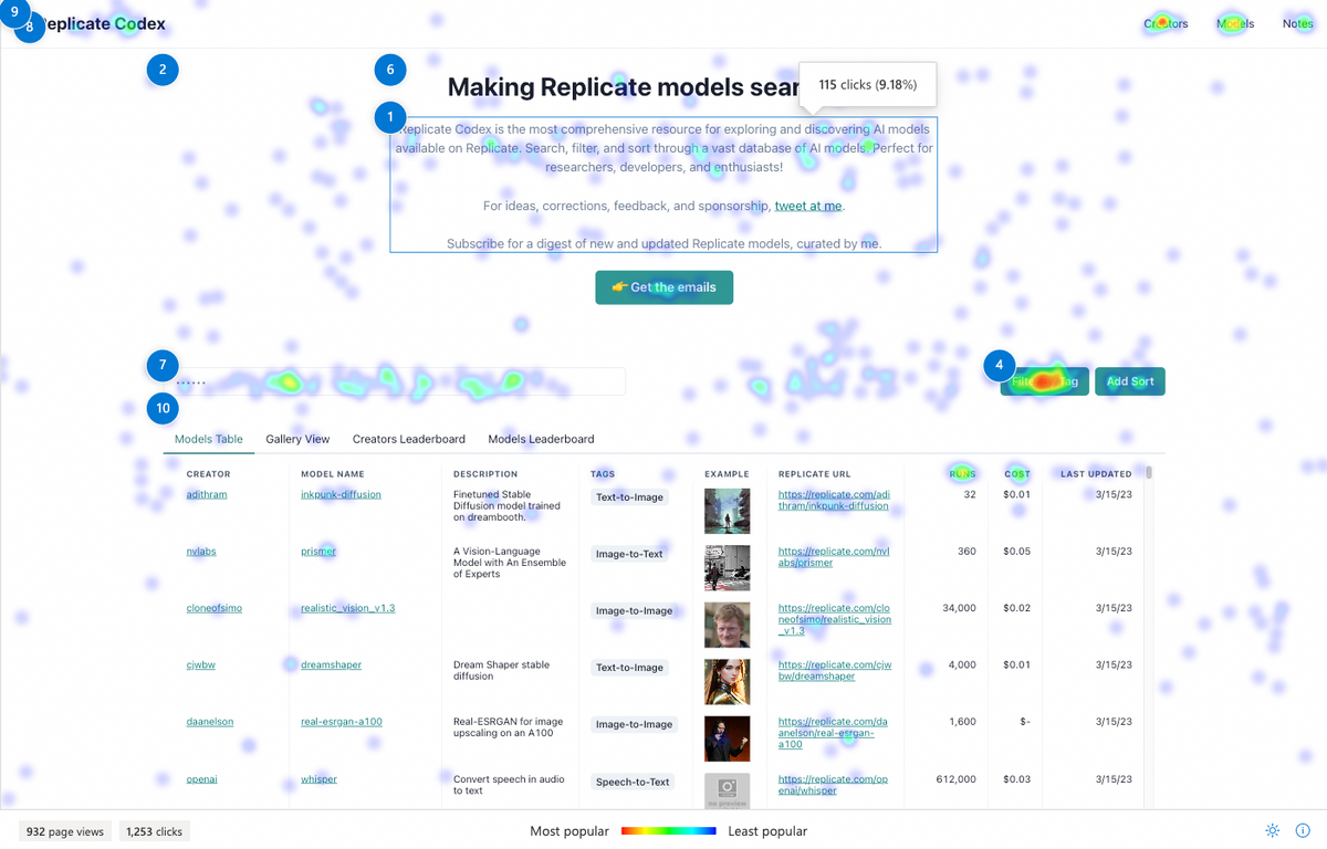
Based on the recordings I watched and the heatmap data, I realized that I needed to shorten and redesign the homepage. On mobile, the text at the top looked especially cramped. I read five or so articles on displaying data better on mobile devices, and this one was by far the best I found. I implemented some suggestions from it, and you can see the "before and after" below.
Leaderboard and Search
Surprisingly, the leaderboard was quite popular - it had tons of clicks! I thought about gamifying it a bit, but I wasn't sure how. If you have any ideas, please share them in the comments!
Search was also really popular, which makes total sense. I want to add an "AI assistant" where you can describe your project and get recommended models... not sure the proper UX for that yet. May be its own page.
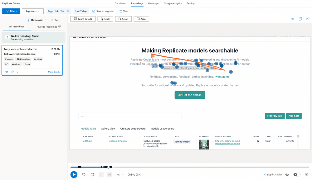
Rage Clicks
I only saw one rage-click session, which was kind of funny (see image below). It made me realize that, overall, users were not getting too frustrated with the website. That's a win!
Conclusion: How can I improve?
I'm always looking for ways to improve Replicate Codex, so if you have any suggestions on how to make it better, please let me know! Also, I'd love to hear about your experiences with Microsoft Clarity or any other analytics tools.
In conclusion, using Microsoft Clarity's free tier has been a game-changer for improving the Replicate Codex landing page. If you haven't tried it yet, I highly recommend giving it a shot. It's a fantastic tool for understanding user behavior, and the insights you gain can help you make data-driven decisions to optimize your website.
Remember that it's crucial to have enough traffic for the data to be valuable, but if you do, Clarity can be a great asset. I hope my experience has been helpful, and I look forward to hearing your thoughts and suggestions!
Happy optimizing!
Subscribe or follow me on Twitter for more content like this!


Comments ()